
Kallen Web Design has created amazing websites for over 100 small businesses, service providers, large corporations and not-for-profits. Through our effective websites, our clients have found new customers online and increased sales by hundreds of thousands of dollars.
A large percentage of our new business comes through direct referrals from our current clients, demonstrating our consistently high level of client satisfaction!
Here you’ll find a selection of our recent work. Your new website will be just as marketing focused & easy to use, and the source of new sales and business growth for years to come.

Website: www.drearthmoving.com
Industry: Excavation and Earthmoving
Location: Whitmore Lake, MI
Kallen Web Design gave us a huge upgrade compared with our old website. Kathleen created a modern, professional design, and Hugh worked closely with us on what to include, along with the wording, photos and a fantastic photo gallery. They are very easy to work with and responsive. The site really shows potential clients what we have done and are capable of. It also is listed very high on the search engines for our industry. Very satisfied!
Ryan Look
Managing Partner
D&R Earthmoving LLC

Website: www.arboristserviceskzoo.com
Industry: Arborist & Tree Services
Location: Kalamazoo, Michigan
Thank you to Hugh and Kathleen Kallen for helping Arborist Services of Kalamazoo, LLC so aptly convey our service brand through the development of a new website. Their creativity, skill and patience from inception to final edits delivered a highly productive process that allowed us to further evolve our messaging in real time. Especially appreciated were the weekly progress meetings and the timely production and changes realized from these efforts. This is the second website Kallen Web Design has developed for us and we look forward to working with them again as the need arises.
B.F. Yost
Owner/General Manager
Arborist Services of Kalamazoo LLC

Website: www.arverhomes.com
Industry: Home Builders
Location: Paw Paw, Michigan
Our business is growing fast, so we needed a quality website to show our homes to potential customers. Kallen Web Design put together an excellent site that highlights our features and our building process. They have been very easy to work with, even with my busy schedule. The site is better than I hoped, and the investment was very reasonable. I think any business will be very satisfied if they choose Kallen Web Design to create and manage their website.
Chris Arver
Owner & CEO
Arver Homes

Website: www.865wellnessketamine.com
Industry: Ketamine + Vitamin Infusion Center
Location: Knoxville, TN
After seeing the other Ketamine Infusion Center websites Kallen Web Design created, I knew they were the right company for our new clinic. They took my ideas about style and made a site that is exactly what I needed. They are very responsive and thought of everything! The search engine work is fantastic, too. Even though we are new we are already on the first page of Google and climbing. The cost was affordable and they are very easy to work with - the service we receive from Hugh and Kathleen is truly excellent! I can honestly say you will not go wrong working with Kallen Web Design.
Jennifer Watson, CRNA
Clinic Owner/Manager
865 Wellness+Ketamine

Website: www.elitewashdown.com
Industry: Pressure and Power Washing
Location: Mattawan, MI
As our company grew we needed a website so I contacted Kallen Web Design and they have been fantastic. Kathleen came up with an amazing new logo and website design, and Hugh wrote words and found pictures that perfectly fit our company. Their SEO work is great, registering us on Google, Google Maps, Bing, Yahoo and all the others, creating our Facebook page, and adding hundreds of links to our site. My site works perfectly on phones, tablets and computers. They have been very easy to work with. After my experience, I absolutely give Kallen Web Design five stars. Feel free to call me for a personal reference!
Mark Pushard, Owner
Elite Washdown, LLC

Website: www.smmlparish.com
Industry: Church / Religious Organization
Location: Chicago, IL
I just can't say enough good things about Kallen Web Design. Not only is our website so much nicer than anything we had hoped for, but working with Hugh and Kathleen was a dream compared to our typical experiences. Hugh led our team through the process in a truly painless way step by step. His knowledge of websites and what we should have on ours was a tremendous help. Kathleen designed and created such a beautiful site, our parishioners are so proud of it. And the cost was lower than other quotes we received. I welcome anyone to contact me for more information or a personal reference.
Kelly Florek, Operations Director
Sts. Martha, Mary and Lazarus Church

Website: www.epsind.com
Industry: Custom Casting
Location: Ferrysburg, MI
We contacted Kallen Web Design because we had neglected our website for far too long. Hugh and Kathleen came onsite and set up a photo studio to get photos of our product and our production process. They updated our old wording and used the photos they captured to create a mobile friendly site that is as good or better than companies 10 times our size. They were very easy to work with, worked with our time availability, and the cost was a very good value for what we received. I'm happy to recommend Kallen Web Design to anyone needing an updated website.
Ed Summers, Founder
EPS Industries

Website: www.corgisinablanket.com
Industry: Corgi Breeder
Location: Kalamazoo, MI
Wow! All I can say is "wow!" We're very happy with the website Kallen Web Design created for my Corgi breeding business. The site is beautiful! They definitely went above and beyond what I had expected. They worked with my schedule and gave me wise advice about what to include. Their communication was excellent, keeping the development process moving quickly without it getting overwhelming. The site is very high on google and we're getting thousands of visitors and so many email sign-ups. Thank you Hugh and Kathleen!
Stacey L. Marquee-Flentje PhD, Owner
Corgis in a Blanket

Website: www.stetlerconstruction.com
Industry: Custom Home Builders
Location: Battle Creek, MI
Our website was outdated. We saw a site Kallen Web Design did for one of our clients and knew they would do a fantastic job. Hugh and Kathleen created an amazing site for us that really shows off our custom homes. The cost was reasonable and they took a lot of time to understand our business and marketing needs and our preferences. We are recommending Kallen Web Design to other companies we work with.
Annie Stetler, Owner
Stetler Construction

Website: www.omegacastings.com
Industry: Manufacture and Sell Alloy Cast-Link Industrial Conveyor Belts
Location: Battle Creek, MI
For a few thousand dollars we now have a website that is better than our multi-million dollar competitors'. I'm sorry we waited so long to call Kallen Web Design!
Brett Cutshall, CEO
Omega Casting

Website: www.ultrahomeinspectionsllc.com
Industry: Home Inspection Services
Location: Kalamazoo, MI
I hired Kallen Web Design to create the online presence for my new business. Hugh and Kathleen created a terrific website and worked very quickly to complete a site that is exactly what I hoped for. The site is better than any other home inspector site I’ve looked at. The price was quite reasonable, and they were very easy to work with. Definitely a great team and a great value. I can’t recommend Kallen Web Design highly enough!
Kevin Crowe, Owner
Ultra Home Inspections LLC

Website: www.marksprofessionaltreeservice.com
Industry: Tree & Landscape Maintenance
Location: Grand Rapids, MI
Another web designer dropped the ball and our site was down. Kallen Web Design had a temporary site up in a day or two, then completed a great new site for us in a matter of a few weeks. This included creating new services pages, writing the content, finding great photos, search engine optimizing everything, and working with Google to get our ads running again. Very happy with their services!
Mark Smith, Owner
Mark's Profession Tree Service

Website: www.endresinsuranceagency.com
Industry: Medical Insurance
Location: Kalamazoo, MI
Kallen Web Design completely revamped my outdated website in a matter of a few weeks. They found amazing photos and added many features we needed, including reviews, our service area, and a blog. They quickly updated our Google listing. Hugh and Kathleen are very easy to work with, and their communication is excellent. The cost was quite fair. We are so excited about our new website!
Dorothy Endres, CEO
Endres Insurance Agency

Website: www.hoffmanbrosinc.com
Industry: Civil Construction Contractors
Location: Battle Creek, Michigan
The site came out GREAT! Our wireless provider viewed our site and commented that it was the best “construction company” website they had ever seen! Thanks for everything you've done!
Jesse Pero
Lead Project Manager
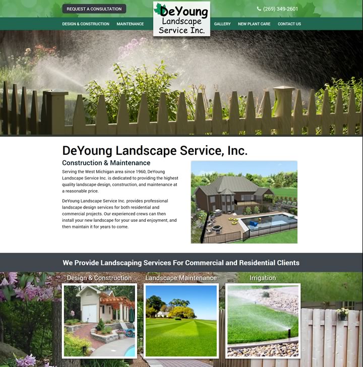
Website: www.deyounglandscape.com
Industry: Landscape Design & Construction, Landscape Maintenance
Location: Kalamazoo, MI
The first website Kallen Web Design created for us was great but looked a bit dated after several years. They redid the site to be mobile-first, and with a whole new design. The turn-around time was really fast and it required a minimum of input on our part. Unlike so many companies, they really do give dedicated, one-on-one service. Our old website brought in so much business, we’re not sure we can handle the increase that will be coming, and we’re very pleased with the new site and with Kallen Web Design.
Rick Eshuis, Managing Partner
DeYoung Landscape Service

Website: www.appliedasset.com
Industry: Financial
Location: Kalamazoo, MI
Hugh and Kathleen did a fantastic job on developing my website for my new business. Hugh was very patient and guided me through the process to meet the outcomes that I wanted. Their services were a great value. I highly recommend Kallen Web Design.
Mark De Clercq, Certified Asset Manager
Applied Asset Management

Website: www.adapt-technologies.net
Industry: Medical & Healthcare
Location: South Haven, MI
We are very happy with the site Kallen Web Design created for our business. Hugh and Kathleen are great to work with. They really took the time to understand our business and the services we offer. They did a great job on the design and also were a huge help with the words and images for each page. This is a substantial upgrade from our old website. I highly recommend them.
David Cooper, Owner
Adapt Technologies, Inc.

Website: www.hcderm.com
Industry: Medical & Healthcare
Location: New Braunfels, Texas
Wow! Working with Kallen Web Design to redo our website was so much easier than I had anticipated. They understood what we needed to market our practice and made many helpful suggestions. Once everything was agreed on, the site came together quickly. We have had numerous compliments. I recommend them highly.
Dr. Quintero
Hill Country Dermatology

Website: www.houseofmemoriesestateservices.com
Industry: Family Business, Sales
Location: Grand Rapids and Kalamazoo, Michigan
Kallen Web Design amazing! We are so glad we found them. The site is terrific, the investment was reasonable and the value we receive is fantastic. We love our site and so do our clients.
Kyle & Beth Hansen, Owners
House of Memories Estate Services

Website: www.michigan-campgrounds.com
Industry: Hospitality / Resort / Vacation
Location: Muskegon, Michigan
It was a pleasure working with Kallen Web Design on the development of our website. The site looks amazing and we have had tons of positive feedback from our customers. They listened to our ideas and were there to answer all the questions we had. Their professionalism was top notch! We never felt as though we were anything but their most important customer!
Shaun and Jean Gonsalves
Owners

Website: www.superiorfleetbodyrepair.com
Industry: Truck and Automotive Repair
Location: Kalamazoo, Michigan
Kallen Web Design has been our go-to for internet marketing since 2012. They have given us an excellent online presence that consistently brings in new customers. Working with Hugh and Kathleen, we have never had to worry about our website, they take care of everything. I regularly recommend them to our business associates. Their services are a tremendous value.
Ray Mikowski
Owner

Website: www.allergyasthmagrandrapids.com
Industry: Medical & Healthcare
Location: Grand Rapids, Michigan
I'm glad our practice consultant recommended Kallen Web Design. In a matter of a few weeks, they took our web presence from zero to 100! Our site is attractive, easy to use, and is on the first page of Google for our searches.
Mark M. Millar, M.D.
Board Certified Allergy-Immunology

Website: www.kazoochimney.com
Industry: Service
Location: Kalamazoo, Michigan
Kallen Web Design did another fantastic site for us! They did such great job on our first website, we knew right away who we needed to take care of our online marketing for our next great adventure. They are very experienced and so easy to work with. To see what I mean, just check out our website! What an awesome site, and the phones are really ringing!
Marie Murray, Owner and Office Manager
Kazoo Chimney and Home Services

Website: www.resiliencyprojectkzbc.org
Industry: Grant Funded Non-Profit
Location: Battle Creek & Kalamazoo, Michigan
We love how Kallen Web Design put this together. The design is excellent. They have always been very easy to work with. And we're grateful they were able to carefully navigate the grant requierements with us. The site has been a real service to the community. I recommend Kallen Web Design for any grant funded website projects you may have.
Erin Reedy Tonda, Victim/Survivor Navigator
Battle Creek Community Foundation

Website: www.neuromendcenter.com
Industry: Medical & Healthcare
Location: Lafayette, LA
Kallen Web Design designed and developed our Ketamine Infusion Center website while our practice was still in the planning stages. The website they designed and created is excellent. It is informational, marketing focused, beautiful, and top on the search engines. They created our Facebook page and our Google listing too. They have always given us dedicated, one-on-one service. We are now up to 5 locations and Kallen Web Design has given us the excellent ongoing support we've needed all along the way. We owe much of our exponential growth to their terrific website.
Jamie Holmes, MBA
The Pelon Group

Website: www.apexflamellc.com
Industry: Aircraft Flammability Testing Lab
Location: Vicksburg, Michigan
The website looks great and I can't say it enough about how much of a pleasure it has been working with you and Kathleen on this project. Everyone who visits the website comments on how professional it looks. I give the credit for that to your entire team, thanks for everything!
Travis Wilcox, CEO
Apex Flame

Website: www.landmarkdressage.com
Industry: Professional Dressage Training
Location: Kalamazoo, Michigan
After seeing the fantastic website that Kallen Web Design crafted for my father's aluminum fabrication company, I knew they were the right choice for my business. Thanks to Kallen Web Design and Kathleen & Hugh Kallen, we now have an updated site that is at the top of our industry!
Brad Cutshal, CEO and USDF Medalist
Landmark Dressage

Website: www.connect-resources.com
Industry: Staffing, Recruitment and Placement
Location: Grand Rapids, Michigan
In the 14 years since you first created my website and through the evolution of online marketing, my website and your marketing saavy helped grow our busines from a small operation to a huge company. Working with you is great, thanks for all you've done for us over the years.
Todd Hanson, CPA
CEO Connect Resources

Website: www.mstpc.com
Industry: Accounting, Finance & Business Consulting
Location: Grand Rapids, Michigan
We partnered with Kallen Web design at the recommendation of one of our clients and have worked with them for several years. They are professional, easy to work with, and very responsive to even last minute requests. You will never be disappointed if you choose Kallen Web Design to manage your company's online marketing.
Mark Thorne CPA
Partner, Monroe Sweeris & Tromp, PLC

Website: www.hoekstraroofing.com
Industry: Contractors, Commercial Roofing
Location: Southwest Michigan
Every job I get, they say they gave it to me because I have the best website they have ever seen! Please have potential clients call me for a reference.
Steve Hoekstra, CEO
Hoekstra Roofing
We’d love to hear about it. Take five minutes to call or fill out a project form. You'll have a chance to speak directly with the Kallen Web Design owners, and start down the path to having the website you need to increase your business or market your organization.


